Because there are now more mobile users than desktop users, it is essential for websites to be mobile-friendly in the current digital era. This article will walk you through the steps of making your WordPress mobile-friendly, ensuring that users can easily access your site from any device.
Why Is It Important to Have a WordPress Mobile-Friendly?
Now more than ever, a website must be mobile-friendly. WordPress Mobile-friendly is a key component of your SEO strategy because Google’s algorithm gives priority to it in search results. A mobile-friendly website also improves user experience, which can greatly boost your site’s engagement and conversion rates.
Choose a Responsive WordPress Theme:
The first step towards making your WordPress mobile-friendly is choosing a responsive theme. A responsive theme automatically adjusts the layout of your website to fit the screen size of the device on which it’s viewed. WordPress offers numerous free and premium responsive themes that you can choose from.
Use a Mobile Plugin
If you don’t want to change your current theme, you can use a mobile plugin. Plugins like WPtouch can help you create a mobile version of your site without affecting its desktop version. You can start using WPtouch by navigating to the “Plugins” section from the left-hand menu and click on “Add New”. In the search bar, type “WPtouch” and press enter.

Once the WPtouch plugin is activated, it automatically applies a mobile theme for visitors on mobile devices. The desktop theme continues to display for non-mobile visitors.
To configure WPtouch settings:
- In your WordPress dashboard, go to the WPtouch menu item in the left-hand menu.
- Here you can customize your mobile theme. You can choose a different theme, customize the appearance, and choose which pages to display on your mobile site.
- In the “General Settings” tab, you can enable or disable WPtouch for different devices. You can also choose whether to show the desktop or mobile theme by default.
- In the “Menu + Icons” tab, you can set up your mobile site’s menu. You can add items to the menu, and choose icons for each menu item.
- In the “Theme Settings” tab, you can customize your chosen theme. You can choose colors, fonts, and layout options.
- After making changes, don’t forget to click “Save Changes” at the bottom of the page.
Remember, WPtouch does not affect your desktop theme; it only provides a mobile theme for mobile visitors. Your desktop theme remains unchanged, and you can customize it separately from the WPtouch mobile theme.
Please note that the above instructions are for the free version of WPtouch. The Pro version offers additional features and much more options for customization.

Optimize Images and Videos
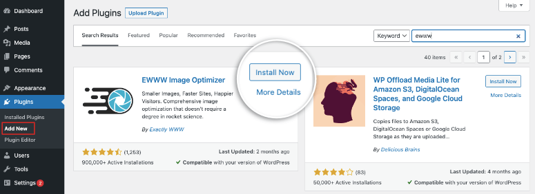
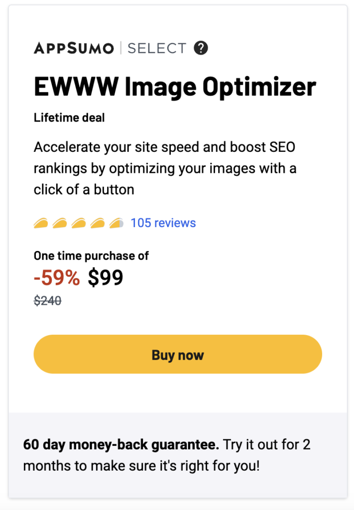
Large images and videos can slow down your website’s loading time, especially on mobile devices. Optimize your media files for mobile devices using plugins like Optimization or EWWW Image Optimizer.
How to Use
To use the EWWW Image Optimizer WordPress plugin on your WordPress website, follow these steps:
- Install the plugin by going to the “Plugins” section of your WordPress dashboard and clicking “Add New.” Search for “EWWW Image Optimizer” and click “Install Now.”
- Activate the plugin by clicking “Activate.”
- Once the plugin is activated, you can access the settings by going to “Settings” and then “EWWW Image Optimizer.”
- In the settings, you can choose which image sizes to optimize and whether to optimize images automatically as they are uploaded. You can also choose which image formats to optimize and whether to convert images to the most efficient format.
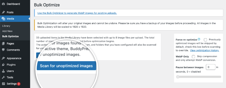
- If you have existing images in your media library that you want to optimize, you can use the “Bulk Optimize” feature to optimize all of the images at once. To do this, go to “Media” and then “Bulk Optimize.” Select the images you want to optimize and then click “Start Optimizing.”
- To optimize new images as you upload them, simply select the “Automatic” option in the settings and the plugin will optimize the images automatically.
It’s important to note that the plugin may not be able to optimize certain images if they are already optimized or if they are in a format that the plugin does not support. In these cases, the plugin will skip the optimization process for those images.
Give it a try!
Implement AMP (Accelerated Mobile Pages):
AMP is an open-source project designed to make web pages load faster on mobile devices. By implementing AMP, you can significantly improve your site’s mobile loading speed, enhancing user experience and boosting your SEO.
Install and Activate the AMP Plugin
Go to your WordPress dashboard, navigate to “Plugins” > “Add New”. Search for “AMP for WP“. There are several plugins available, but the official AMP plugin developed by AMP Project Contributors is a good choice. Click “Install Now” and then “Activate”. I suggest using the PRO version because you will unlock all the features, check the prices below:

Test Your Site’s Mobile Friendliness
After implementing the above steps, it’s essential to test your site’s mobile friendliness. Tools like Google’s Mobile-Friendly Test and Bing’s Mobile Friendliness Test Tool can help you identify any issues that need to be fixed.
Optimize Your Site’s Navigation
Mobile screens are smaller than desktop screens, making it crucial to have a simple and easy-to-use navigation menu. Consider using a hamburger menu or a dropdown menu to ensure that your site’s navigation is WordPress mobile-friendly.
Make Your Website’s Content Mobile-Friendly
Break your content into small paragraphs and use subheadings, bullet points, and numbered lists to make it easier to read on mobile devices. Also, ensure that your font size is large enough to be read on small screens.
Enable Google’s Mobile-First Indexing
Google’s mobile-first indexing means that Google predominantly uses the mobile version of your site for indexing and ranking. Make sure that your site is mobile-friendly and that your mobile version has the same content as your desktop version to benefit from mobile-first indexing.
Improve Your Site’s Speed
A slow-loading website can frustrate users and increase your site’s bounce rate. Use tools like Google’s PageSpeed Insights and GTmetrix to test your site’s speed and get recommendations on how to improve it. NitroPack is a powerful WordPress Speed & Performance Optimization and other platforms such as Magento and OpenCart speed optimization tool. It was originally designed for OpenCart, however, there is now a separate plugin for WordPress websites.
Make Your Forms Mobile-Friendly
If your website includes forms, ensure that they are easy to fill out on mobile devices. Use large, clickable buttons, and keep your forms as short as possible.
Summary
Making your WordPress mobile-friendly is not just about adapting to the increasing number of mobile users; it’s also about improving your site’s SEO and user experience. By following the steps outlined in this article, you can ensure that your site is accessible to all users, regardless of their device.